Pro Graphic Designer
Painesville Ohio, Lake County, near Cleveland
A pro graphic designer knows their craft cold, is proficient, efficient, and easy to work with…samples follow below.
Pro graphic designer images…
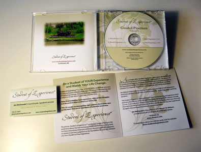
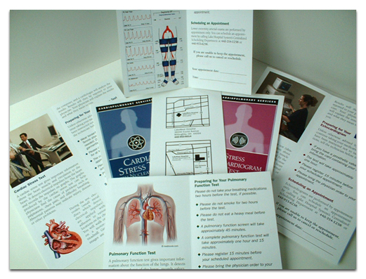
Below are various images of graphic design work that I have created for clients. These range from logos to a brochure series to CD covers and descriptive collaterals geared to company identity…


Use a pro graphic designer for design or redesign of your collaterals:
~ Design or redesign of printed materials and electronic images by a pro graphic designer makes a huge difference to the business identity. Materials that represent your company or organization are too important to be left to an amateur.
~ Collaterals by a pro graphic designer such as a logo, icons, brochures, newsletters, bulletins, letterhead, envelopes, business cards, and many more provide an important polished and professional look. Much of this also comes into play for a graphic designer to create and help to implement branding, a corporate or company identity. These critical elements of business – and make no mistake, they are central and critical to the organizations mission – are projected by what? Your printed and electronic materials.
As a pro graphic designer, I create brands and business or organizational identities – All collaterals
For a full range of services, also see Illustration and Client Services
In addition, we offer professional writing and editing services at my other site: Hawkeye Services
(should open in a new page – more samples also below)
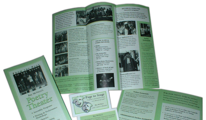
Graphic designer for BROCHURES, PRINT, BUSINESS IDENTITY:
“Both image and substance are essential when soliciting gigs in the performing arts. Kristen and Lodestar helped me put together brochures, flyers, and items that convey the energy and essence of what I do. Importantly, all of these have helped create numerous bookings.”
– – Ray McNiece, Poet Laureate, Page-to-Stage Productions

Company and Organization Logos
Any research into the landscape of modern logo creation or purchasing will reveal that it is SNAFU and FUBAR. How so? Some larger corporations, health care organizations, and businesses that darn well should know better, make huge marketing mistakes. Logo mistakes. Identity mistakes. Errors. IF I NAMED THESE ORGANIZATIONS YOU WOULD KNOW MANY OR MOST OF THEM.
ERRORS?
Big errors like what? Firstly, like simply buying a logo from “logo factory” that pumps out random images and that produces and sells “really cheap logos.” Secondly, something that looks like a money savings becomes a very expensive shortcut. Lastly, these parties bought an image without doing all the steps in creating a logo that is customized 100% to their operation. Different. Distinctive. Positioning. Eye-catching. UNIQUE, a major facet. Caveats, rules, and steps in creating a logo are not followed by the ignorant, uniformed, or the lazy. It costs!
These logos below of DIFFERENT ORGANIZATIONS that illustrate this.
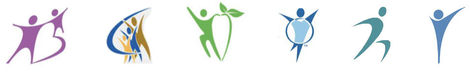
Snappy, eh? Six organizations! Their logos essentially look ALL THE SAME, obviously. Unique? Different from competitors? Stands out in a crowd? A big NO! Compare these to unique logos that you know, famous ones like Coca Cola, IBM, Giant Eagle Supermarkets, McDonalds, even Fritos. They’ve all purchased essentially the same thing. This violates the most basic understanding of creating a unique, integrated identity for an organization, unless someone subscribes to the idea that “I want my operation to just look like every other business.” You get what you pay for, so roll the dice going to a logo factory in India or the U.S. But read the fine print they have about lawsuits before taking another step with them. For a truly unique logo customized to your organization, you can Contact me.
.
BELOW: PREP work for design of a logo… DEVELOPMENT PHASE

Items shown above are from the development phase of the logo for Titan Tubulars. It’s creative work, producing something distinctive and eye-catching where nothing previously existed. Nothing. Prior to this, there was no “look” to the company. Subsequently, just Titan Tubulars in Times New Roman font/type in black and white.
Titan Tubulars
FINISHED LOGO
See development phase for this logo shown just above.
This is serious and professional work that takes time, research, understanding, analysis, and then drafts, much discussion, revisions, and final touches. You can’t buy that off the shelf.
“Perfect, Kristen. Just what I was looking for.”
– – Managing Director, Titan Tubulars
A Pro Graphic Designer Completely Customizes a Logo to the Client
As a matter of course, logos are designed by working closely with the client, their objectives, their essence, their position, etc. Again, her logo is unique, different, distinctive, far beyond the supposedly symbolic and colored little stick figures that all those organizations (line of figures above) bought from a logo factory. My client is more than happy with this representation of what she provides. Understandably, the logo appears on all her materials, from business cards to letterhead, forms, company materials. Green, as in growing, growth, vital, alive, the circularity also symbolic of the universe. In conclusion, no other company in her field has anything like this. Stand apart.

A Pro Graphic Designer Incorporates Positioning Against Competition
In the extremely competitive field of wholesale security product distribution, this company and certainly this logo stand out. Remarkably. Far different than any competitor, large or small. However, there is far more to this logo than may meet the eye, as it is very heavy on positioning the company against competitors. Symbolic are the encompassing circles, suggesting that the company actually “encompasses” SECURITY, encircling the name; the gold and the blue are suggestive of the sun and the moon, the only thing missing is the stars, e.g., they have almost everything. Straight out they state their position proclaiming they are the leaders, suggestively where others may provide run-of-the-mill services by people probably less than professional, this company promises to deliver more. Success.
– – Design by Kristen Stuart, Tag lines by Don Calderwood.
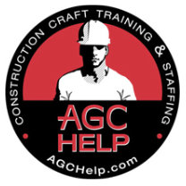
A Pro Graphic Designer Uses Symbols and Words to Relate to the Audience
So what is this? One aspect of AGC HELP was conceived to particularly attract Latinos to enroll in training classes to learn construction skills in an environment that has been difficult to traverse for laborers who are unskilled. “Who can help me?” is a frequent question or lament of those in the community. So if you’re AGC HELP a good move would be to have a logo that clearly says HELP and shows a man in a hardhat. Maybe they could help me, no? Yes. However, not in Spanish? No, as there are other interfaces for AGC, like governments and employers, and, most importantly, the logo gets several messages across along with other copy and advertisements to different key groups.